Atlas
A redesign of a legacy fraud-investigation tool — a scattered workflow brought into one workspace.
Product overview
Atlas is an enterprise platform for investigations and complex case management used by operational and analytical teams.
For over 10 years, it evolved into a technically powerful system serving ~500 internal and ~5,000 external (client) users but without UX strategy, a design system, or documentation. Over time, it became fragmented, with no unified search, entry point, or consistent navigation. Users had to switch between multiple systems and logins to complete a single workflow.
Despite this, the product remained critical due to its functional depth, while facing increasing competition from simpler, more modern solutions. The goal was to modernize the experience without losing functional power.
Process
Work started with UX research, driven by the lack of documentation and defined processes. The goal was to understand how the system was actually used in real operational work.
I ran interviews and field research across different roles and scenarios, focusing on how users adapted to the system's complexity. Findings were turned into behavioral patterns and an understanding of scenarios that informed iterative design work.
The process was embedded into product and engineering sprints with continuous validation — prototyping, collaboration with engineers, feasibility checks, and user testing.
Problem
The challenge was to unify a fragmented legacy system without reducing its functional depth.
- Fragmentation. There was no unified search, entry point, or navigation — a single workflow was split across multiple systems and logins.
- Complex role-based workflows. Access and flows depended heavily on the user's role.
- High cognitive load. Dense data and loosely defined operational processes.
- Delivery pace. Fast, iterative releases while maintaining stability for existing customers.
The experience had to be modernized without losing the product's functional power.
Results
A fragmented legacy tool became one workspace — here is what changed for the teams who use it.
01
One unified workspace
Unified search and a single entry point — the whole workflow now lives in one place instead of many systems and logins.
02
Role-based clarity
Role-based flows brought into one consistent navigation, so each role sees a clear, relevant path.
03
Lower cognitive load
Data restructured with a clearer hierarchy and defined flows, cutting noise on complex, data-dense screens.
04
Stable delivery
Shipped iteratively on a MUI design system — a zero-incident migration with no disruption for existing customers.
9 screens
Collaboration
- Product Manager: defined problems, priorities and scope together, translating business needs into clear user scenarios; aligned on solutions before build and reviewed them along the way.
- Design Lead: aligned the work with the product vision, design system and visual principles, and reviewed decisions to keep them consistent.
- Developers: walked the team through user flows and interactions, discussed technical constraints and opportunities, adjusted designs accordingly, and verified the build against the intended design.
- QA: validated interfaces against scenarios, surfaced UX/UI inconsistencies, and improved the quality of the final product.
- CS & Support: the main source of user insight — through interviews and testing I surfaced problems, tested hypotheses, and validated solutions.
UX strategy
A plan of actions designed to reach an improved future state of the product’s user experience over an established period of time.
Framework based on best practices from the Nielsen Norman Group · UX Strategy Study Guide and the ResearchOps training course.
- Vision — a statement of intent describing the improved state we’re aiming for. It helps the team articulate UX goals and prioritise effort.
- Goals and the metrics that tell us whether we’re getting there.
- Plan — the detailed steps and objectives to reach each goal.
Method
A user-centered method — every decision traces back to real users and their needs.
Discover
Research users & their needs
Frame
Define the real problem to solve
Vision
An improved future state to aim at
Goals
Measurable outcomes to drive
Plan
Quarter-by-quarter objectives
Measure
Track impact & iterate
Components
Plan, Goals and Vision form the UX strategy; execution sits on top. (NN/g)
Vision & mission
Vision statement
Maintain our position as an industry leader by offering comprehensive risk-management and fraud-prevention solutions that set the standard for convenience, efficiency, and effectiveness — unifying all data and tools into a seamless, intuitive ecosystem that minimises risk, accelerates decision-making, and drives revenue. Design is a strategic force that connects technology, data, and business objectives into one cohesive experience that delivers measurable value.
Design mission
Create simple, effective interfaces that support business goals, accelerate decision-making, and optimise processes — giving clients intuitive access to key tools and data, and following best practices and industry standards to ensure the highest quality and consistency of every solution.
Why now
The problem this strategy solves
The product grew feature by feature. Analysts move fast against live fraud signals, but the experience they rely on became inconsistent, the data scattered, and onboarding a new hire slow. This strategy exists to pull it into one foundation — so the team ships faster, onboards easily, and every screen feels like one product.
Inconsistent
UI patterns differ across surfaces — every team rebuilds the same components.
Hard to learn
Non-expert and new users face a steep ramp with little self-service.
Scattered
Tools and data live apart, so investigation context is rebuilt by hand.
Goals · 2025
Each goal needs a plan, broken into objectives — the actions to reach it over time. Objectives may solve a known problem, explore new opportunities, or call for further research.
01Persona-driven design
Goal: Deliver personalised experiences tailored to key personas — executives, fraud analysts, compliance, and others.
Metrics
- Personas use features built for them more often and more effectively.Measure: feature usage by persona segment vs. the Q1 baseline.
- Persona satisfaction score of at least 4 / 5.Measure: quarterly persona satisfaction survey.
02Intuitive experience for non-experienced users
Goal: Create a frictionless, self-service flow for non-experienced users across roles.
Metrics
- Reduce onboarding-related support requests by 50%.Baseline: current onboarding tickets / month — target −50% by year-end.
- Minimise time needed for training on product usage.Measure: time-to-first-successful-task for a new user.
03Build and deliver high-impact new features
Goal: Ship innovative, high-value features aligned with business needs — advanced reporting and analytics, better fraud-investigation tools, and a channel for client feedback.
Metrics
- Build UI/UX for the major new features of 2025, validated against business priority and roadmap.Measure: features shipped vs. roadmap commitment.
- Drive adoption by relevant personas within three months of launch.Measure: % of target persona active within 90 days of launch.
04Establish a cross-product UI/UX library
Goal: Develop a unified design system to WCAG standards for consistency, scalability, and adaptability across all products.
Metrics
- Meet WCAG level A and AA per US requirements.Measure: accessibility audit pass rate across core screens.
- Adoption of the library by product teams is strongly recommended.Measure: number of teams building on the shared library.
- 30% reduction in UI design and build time via reusable components.Baseline: current design + build time per feature — target −30%.
Plan · scope of work
The 2025 plan lived as one long planning table. To keep it usable I scoped each objective the same way — what's included, why it matters, the practice it follows, and its priority.
The full plan at a glance
P1 Now
P2 Next
P3 Later
Q1
Move the product onto one design system Scoped below ↓
Rebuild core components — tables, buttons, fields, nav
Competitor & UI best-practice research
Q1 – Q2
Build the shared UX foundation & repository Scoped below ↓
Product & marketing personas + journey maps
Onboarding & service-design paths
Q2 – Q3
Build the advanced home page
Page headers, modals & client selector
Autocomplete & new-user flow
Q4 – Q1
Improve fraud-investigation tooling & dashboards Scoped below ↓
Advanced reporting & analytics
Customer feedback loop into the roadmap
First
Foundations land — the design system and UX foundation (Q1), so every later screen inherits them.
→
Then
Features build on top — home page, investigation tooling and reporting reuse the system instead of rebuilding.
→
Throughout
Measure & iterate — research, competitor analysis and QA keep the direction honest.
From plan to scoped work
The three P1 objectives above, scoped in full — an example of how every row in the plan was defined.
Goal 01 · Persona-driven designBuild the shared UX foundation
- Includes
- Value
- One foundation every product goal builds on — a seamless ecosystem, smoother onboarding, and room for features to grow. Journey maps surface what users do outside the product, revealing where it can automate and save cost per working hour.
- Practice
- Grounded in Personas: Study Guide and NN/g UX research — experts, new users, and non-expert roles each modelled explicitly.
Goal 03 · High-impact featuresImprove the fraud-investigation tooling
- Includes
- Value
- Higher-value features aligned to both user and business needs — the analyst workspace, better reporting, and a channel to fold customer feedback back into the roadmap.
- Practice
- Full process end-to-end: UX research → documentation (personas + flows) → Lo-fi & Hi-fi mockups → design QA with frontend, on the MUI design system, verified against WCAG 2.
Goal 04 · Cross-product consistencyMove the product onto one design system
- Includes
- Value
- A single system across the product cuts UI design and build time and keeps every screen consistent — informed by competitor research and UI best-practice teardowns.
- Practice
- Rolled out through the design-system implementation process, surface by surface.Known risk: one legacy surface runs on a different framework — flagged early for a migration plan.
Alongside the scope I ran a lightweight Start / Stop / Continue to clear blockers before picking up new work, and captured stories of value — short narratives of moments the design work paid off — to keep stakeholders, research and competitor analysis pointed the same way.
Persona system
Case study · UX foundation
Atlas's personas lived as static images spread across slides — hard to keep current, inconsistent between products. I audited what existed, ran research with the teams closest to users, and rebuilt them as living documents product, UX, marketing and training work from.
Method — Nielsen Norman Group persona framework · Personas: Study Guide.
3Persona groups — clients, end-users, training
6+9Interviews + survey responses (CS & Support)
3Market segments — big / mid / small
1Shared NN/g-based template
The problem
Personas lived as static images spread across different formats and platforms. They were hard to update and inconsistent between products. The three distinct audiences — the clients who buy, the people who use the tool daily, and the learners in training — were blurred together and sometimes duplicated. And a persona wasn't linked to the journeys or goals it was meant to represent, so teams didn't rely on them.
Approach
The work ran from auditing what existed, through primary research, to a documented structure the teams could maintain themselves.
Audit
Reviewed every existing draft from product, marketing and training for completeness and overlap.
Research
Interviews and a structured survey with Customer Success & Support to capture real workflows.
Synthesis
Clustered goals, tasks, tools, pain points and recurring actions into patterns.
Structure
Separated the three groups, added market segmentation, agreed one NN/g-based template.
Living docs
Documented each persona as a versioned page linked to journeys, use cases and features.
Research behind it
The personas are grounded in primary research with the teams closest to users. Interviews and a survey did most of the work; a follow-up collaborative study captured tasks the interviews didn't reach.
01Interview matrix15 questions × 6 CS & Support respondents
02Personas survey9 structured responses across two groups
03Fraud personas studyCollaborative goals & tasks documentation
04Example personaFraud Analyst — the finished output (below)
Key decisions
System over snapshots
Living documents, not images
I moved personas off static slides into versioned, editable pages. A fixed image caps how much you can capture; a living document lets the knowledge keep growing — new goals, tools, KPIs, barriers and use cases — without a redesign or losing history.
Separation of concerns
Three groups, clearly split
Clients (buyers), end-users, and training personas each serve a different team and purpose. Naming and separating them stopped the duplication and let each team focus on the needs that were actually theirs.
Fidelity to scale
Market segmentation
Needs differ sharply by client size, so both internal and external personas are cut by big / mid / small market — enabling tailored product and communication strategies instead of one-size-fits-all.
A shared standard
One NN/g-based template
Every persona follows the same structure — goals, tasks, KPIs, tools, barriers, learning preferences — linked to journeys and features, so they read consistently and plug straight into product decisions.
Outcome
- One shared template, so personas read consistently across products and levels.
- The three groups are separated, so product, UX, marketing and training each work from the audience that's theirs.
- Each persona links to journeys, use cases and features — usable in product decisions, not just a reference.
- Kept as living, versioned documents: easy to update and extend as we learn more, instead of static images.
One persona in full
Below is one completed persona, Fraud Analyst (Internal) — shown in full so the depth is visible, not just described. It is one of a larger set: the Fraud group alone spans five roles, and that pattern repeats across all three persona groups and three market segments. Every persona follows this same template.
Persona familyFraud group · one of several — shown here in full.
Internal · Fraud Analyst
Robert Clark
“My mission is to stay ahead of fraudsters by closely collaborating with client teams, providing the analytical expertise and support necessary for effective detection and prevention of fraudulent activities.”
Experience1–3 years
Based inUSA · Canada
Reports toFraud Team Lead
ClientsUSA · Brazil
General information
- Role
- Fraud Analyst
- Company
- Atlas / Internal employee / supports external analytics team
- Department
- Fraud & Risk Management
- Work experience
- 1–3 years in fraud prevention
- Managed by
- Persona: Fraud – Team Lead [Internal]
- Industry
- Anti-fraud, compliance & cybersecurity
- Location
- USA, Canada
- Primary clients
- USA, Brazil (new)
Role overview
In his role, Robert actively engages with clients, providing expert support in complex investigations and data analysis. He collaborates closely with client teams to understand their unique needs and develop tailored fraud-prevention strategies. Robert is responsible for analysing suspicious transactions, identifying anomalies, and offering recommendations to enhance security measures — ensuring reliability and protection for clients' businesses.
Contacts: the Fraud & Risk team
Goals & objectives
Role goals
- Proactively identify and prevent fraudulent schemes.
- Build trust and long-term relationships with clients.
- Deploy tools and processes that enhance client efficiency.
Core responsibilities
- Conduct detailed fraud investigations.
- Analyse and interpret large datasets to detect anomalies.
- Provide clients with recommendations to prevent fraud.
- Collaborate with teams to coordinate anti-fraud efforts.
- Develop fraud-prevention strategies tailored to client needs.
Influenced by (balance between)
- Team Lead or Manager (business needs)
- Client needs and feedback (clients' Fraud team)
Success metrics
- Reduction in client fraud incidents.
- Improved accuracy and speed of investigations.
- Increased client engagement through Atlas tools.
- Positive client feedback and high satisfaction levels.
- Recognition of Atlas as a leader in anti-fraud solutions.
Key KPIs
- Achieve a % annual decrease in fraud cases among clients.
- Deploy at least three new automated solutions within the year.
Primary use cases [Atlas]
1Report of suspicious location checking
User story: As a fraud analyst, I want to efficiently analyse the activity of a suspicious location so that I can provide a detailed report with recommendations to our external specialist.
I use the map tool to gather comprehensive information about the location's behaviour and patterns, so I can offer informed, actionable suggestions for further action.
2Note for profile checking for fraud signs
User story: As a fraud analyst, I aim to generate a report with well-founded recommendations for our external specialist by scrutinising a profile for potential fraud indicators.
I rely on profile statistics, historical data and information about related profiles to gather insights and provide actionable suggestions.
3Related items (connection investigation)
User story: As a fraud analyst, my objective is to compile a report by delving into the connections between users and devices, identifying potential fraudulent activity.
This requires the graph tool and table feature to visualise and analyse relationships, so I can provide the specialist with valuable insights.
4Profile history analysis
User story: As a fraud analyst, my goal is to generate a report by meticulously examining a profile's history, comparing clients' records.
I use the history page to extract, analyse and cross-reference information accurately, offering the specialist valuable insights for further action.
Values
- Trust: building client confidence.
- Innovation: constantly improving tools and processes.
- Results-driven: achieving goals through effective strategies and analytical solutions.
Technical competency
- High level of analytical skills.
- Skilled in analysing large volumes of data with sophisticated tools.
- Proficient in Atlas, Kibana Dashboards, account/asset reports, custom reports and GeoFencing.
Technologies used in role
AtlasKibana DashboardsMultiple Account ReportMultiple Asset ReportGeoFencingCustom ReportsExcel
Tasks / product usage frequency
- Daily use: Atlas and Kibana Dashboards for data analysis.
- Regular use: custom report setup, exclusion zones, process automation.
Daily tasks
- Monitoring transactions and alerts
- Conducting investigations
- Collaborating with team members
Weekly tasks
- Trend analysis
- Collaborative meetings / investigations
- Training and knowledge enhancement
Wants & needs
- Advanced and intuitive analytics and insights tools.
- The ability to adapt solutions flexibly to client needs (especially custom).
- Automation of processes to improve efficiency.
Barriers & constraints
- Challenges integrating data across products.
- Adapting quickly to ever-changing fraud tactics that require continuous learning.
- Balancing custom client requests with standardised processes.
Emotional aspects & learning
- A strong desire to stay ahead of fraudsters.
- Satisfaction from creating solutions that genuinely help clients.
- Prefers hands-on learning through real-case analysis, with clear, ready-to-use templates.
Persona family
Internal · Fraud Team Lead
Internal · Fraud Analyst
End-user · Fraud Analyst
External · Fraud Team Lead
Executive · VP of Fraud
Objective
Case study · Design ops
I automated and reorganised the team's Figma files and handoff into a solid, modern foundation for design and product growth — sharpening what already worked instead of starting over.
Scope — component library, file versioning, and the design-to-development handoff.
01Align the component library with Atomic Design principles
02Organise Figma versioning & updates to best practice
03Transition from waterfall to an Agile handoff
04Reduce routine work through automation & clear structure
My role
I owned the review and improvement of the team's design ops. I audited the library, file structure and handoff, pinpointed where they broke from best practice, set the direction to fix them, and drove the changes through with design and engineering.
I kept what was working and strengthened the foundation for growth — improving the system, not restarting it.
Issues identified
01Design library
- Components didn't follow Atomic Design — atoms had errors and weren't properly connected to molecules or organisms; pages were incomplete.
- Inconsistent measurements and outdated components.
- Duplicates and irrelevant elements cluttering production.
- Manual updates and time-consuming searches for the right components.
02Figma file structure
- Branches were used incorrectly, with many unsynchronised drafts.
- The final version was hard to identify and keep up to date.
- Updates relied heavily on manual work.
- Team members struggled to find the correct pages or components.
03Handoff process
- A waterfall approach made designs outdated quickly and delayed development.
- Developers worked with incorrect versions.
- Collaboration between design and development was slow and inefficient.
How it was solved
01Analysis
- Audited the library, files and handoff process.
- Compared the current state to best practice and documented every issue.
- Prepared clear recommendations and an actionable roadmap.
02Team alignment
- Presented findings and solutions to the team through reports and workshops.
- Established transparent communication and created backlog tickets for step-by-step implementation.
- Integrated the work with the new design-library implementation.
New design-library implementation — the deck used to align the team (Figma).
03Planning
- Prioritised the pages and components to update.
- Broke the work into clear tasks while preserving and improving what was already built.
- Assigned responsibilities across the team.
04Execution
- Aligned the component library with Atomic Design — connecting atoms, molecules, organisms, templates and pages.
- Organised Figma branches for drafts and merged them into the main version regularly.
- Removed redundant components and documented the final structure.
- Transitioned the handoff to an Agile approach, improving collaboration with developers.
- Reorganised file storage and updated file covers in the corporate style for better navigation and consistency.
Results
- Components now follow Atomic Design with proper connections.
- Figma files are organised — the latest version is always accessible and up to date.
- The handoff supports continuous product growth: faster and more flexible.
- Automation reduced errors and routine work, freeing designers to focus on creative solutions.
- The reorganised file structure and corporate-style covers improved navigation and clarity.
Conclusion
Structure and automation across the library, files and processes let the team move faster and with confidence — no time lost to routine work or hunting for the right version.
Designers now focus on meaningful solutions, and the product has a stable foundation to grow on.
Objective
Case study · Design system
I turned a fragmented, inherited component library into a design system the team can rely on — consistent, documented, and built around real product needs, so designers ship features instead of firefighting the library.
An audit-led rebuild of an inherited library, delivered alongside the migration to customised MUI.
My role
I owned the review and improvement of an inherited design system. I audited the library end to end, pinpointed every gap and inconsistency, set the direction to fix them, and drove the changes through with design and engineering.
Rather than restart, I strengthened the foundation already in place — building on the chosen framework and the in-flight MUI migration, and shaping the library around real product needs.
Context
The library had grown from Bootstrap plus a vendor-built custom design — a mix that, over time, became incompatible, inconsistent and hard to maintain.
A migration to customised MUI was already underway, but the library beneath it was still disorganised and incomplete: components were inconsistent, unfinished, and off best practice.
My job was to give it the dedicated review it needed — so the MUI migration would land on a solid, sustainable system instead of carrying the old problems forward.
Issues identified
01What I found
- Didn't cover product and business needs — no table component, no date picker, missing text-field states for filters.
- Inconsistent sizes, styles and functionality; missing states, improper naming, inconsistent typography and spacing.
- Redundant or overlapping components — lists vs. dropdowns, snackbars vs. alerts.
- No documentation or usage recommendations.
- No centralised patterns for filters, tooltips, modals and other critical elements.
02Why it mattered
- Inconsistent user experience across products — Explorer, CMS, IAM, IDComply.
- Inconsistent design solutions and component use between teams.
- Constant, time-consuming fixes that slowed every future change.
How it was solved
01Analysis
- Ran a detailed audit of the library, accounting for its history and the ongoing MUI migration.
- Documented all gaps and inconsistencies transparently and by priority.
- Identified the key blockers preventing the team from using the library and growing the product.
◎ Component library
| Components | Type | Status | Priority | Notes |
|---|---|---|---|---|
| Icons | Atoms | Need changes | P1 | Standardise on one icon set instead of mixing icon fonts. |
| Button | Atoms | Need changes | P1 | Three sizes — clarify use cases; icons sit in a masked frame. |
| Navigations (side + top) | Organisms | Need changes | P1 | Align side and top navigation into one pattern. |
| Dialog | Molecules | To do | P1 | Inconsistent — rebuild with proper instance slots. |
| Accordion | Molecules | To do | P1 | Used unevenly across products — standardise. |
| Date / Time | Organisms | Need changes | P1 | Pick one date picker as default; add range support. |
| Table | Organisms | Need changes | P1 | Filters live in the cells for one product; align the rest. |
| Page Header | Organisms | Need changes | P1 | Import the current version and swap atoms (e.g. buttons). |
| Text field | Molecules | Need changes | P1 | Missing the error state with a bottom label. |
| Spacing | Foundation | Need review | P2 | Confirm padding/margins scale in real screens. |
| Radio Button | Atoms | Need review | P2 | Size mismatch — 24px vs 20px + padding. |
| Checkbox | Atoms | Need review | P2 | Size mismatch — 24px vs 18px + padding. |
| Tooltip | Atoms | Need changes | P2 | Almost complete — remove unnecessary instances. |
| Autocomplete | Molecules | Need changes | P2 | Overlaps Select — both share the dropdown. |
| List | Molecules | Need review | P2 | How does it differ from a dropdown? |
| Select | Molecules | Need review | P2 | aka Dropdown — missing a bottom error label. |
| Pagination | Molecules | Need review | P2 | Match the functionality used in tables. |
| Selector (Operator) | Organisms | Need changes | P2 | aka Filter — unify the multiple filter variants. |
| Chip | Atoms | Need review | P2 | No success / warning state — consider adding. |
| Card | Organisms | Need changes | P2 | Source cards incompatible — review transaction / operator cards. |
| Paper | Foundation | Need changes | P2 | Improper naming — use proper naming (e.g. modal 01). |
| Snackbar | Organisms | Need review | P2 | How does it differ from a notification alert? |
| Charts | Organisms | Need changes | P2 | Design differs from MUI and from what's built — align. |
| Skeleton | Molecules | Need review | P2 | Unify loading — spinners vs skeletons vs logo spinner. |
Scroll the sample — this is part of a 24-component audit.
The living audit — every component scored by type, status and priority, with notes on what needed fixing (data anonymised).
02Team alignment
Why: before touching the library, design, dev and QA had to agree on the problems and the plan — changes without buy-in would only add more inconsistency.
- Presented the findings and recommendations to the team.
- Ran workshops to win buy-in and agreed a prioritised backlog.
1
Mockups reorganizationAgile file workflow (Figma Branching) + Atomic Design + a reorganised file structure with corporate-style covers — one always-current, easy-to-navigate source.
Done2
Standardise core componentsReview and fix every core component — sizes, states, typography, date/menu patterns and docs — aligned to Atomic Design and real product needs, cutting routine work through consistency.
In progress3
ImplementationDesign-to-dev process and technical build (Storybook, GitHub).
PendingThe shared roadmap the team aligned on — three workstreams, each with a clear status.
03Planning
- Defined priority tasks and a step-by-step migration plan to MUI while reviewing the library.
- Provided recommendations to simplify and standardise components.
◎ Scope
| Components | Priority | Notes | Tasks | Responsible | Files |
|---|---|---|---|---|---|
| Review | P1 | Review components, identify problems, and prepare a list of fixes. | UI/UX system design reviewDone | @Designer | Attachment |
| Colour | P1 | Update properties: define clear use cases and proper naming; add marketing colours. | Finalize foundation coloursDone | @Designer | Attachment |
| Typography | P1 | Update properties: fix heading and font sizing; remove custom letter/line spacing. | Typography enhancementDone | @Designer | Attachment |
| Icons | P1 | Usage: standardise the icon set and import it into the shared library. | Icon set reviewDone | @Designer | Attachment |
| Date / Time | P2 | Centralise: one adaptable date & time picker with range and quick filters. | Date picker componentIn progress | @Designer | Attachment |
The migration scope — each component prioritised, with notes, tasks and owners (data anonymised).
04Execution
- Standardised the sizes, states and variants of components.
- Standardised naming and removed redundant or overlapping elements.
- Removed outdated Bootstrap and custom components, replacing them with customised MUI.
- Updated documentation for the key elements.
- Reorganised file storage and updated file covers in the corporate style for better navigation.
- In parallel, standardised the design-to-developer handoff — see the Handoff case study.
Figma branching
We adopted the Figma Branching best practice for a product on Agile — a fast, “hot-potato” handoff where work happens on a branch, gets reviewed, and is merged back into main so the main file is always current.
Main file
→Branch
→Updates
→Review
→Merge back
↩into main
Always current
Every branch merges back, so the main file stays the single source of truth.
Scales with the product
Keeps mockups up to date in a fast-growing product.
Better collaboration
Developers and QA always work from the latest design.
Component implementation
Integrating the updated components into design and giving developers detailed recommendations for transitioning to the new system.
Description
Integrate the updated components into design and provide developers with detailed guidance on moving to the new design system.
Goal
Automation and consistency — components become reusable across both development and design, on every product.
1
ActionFinalize component + Doc
Ready for design
2
ActionApply component in mockups
Ready for dev
3
ActionTechnical implementation + QA (Storybook)
Ready for reuse in other products
✓
OutcomeDelivery
Every component runs the same pipeline — finalize → apply → build & QA → ship — so it becomes reusable across design and development. Goal: automation and consistency.
Results
The design system spans foundations, core components, patterns and documentation. Below is a small sample of the library — a few representative pieces, not the whole system.
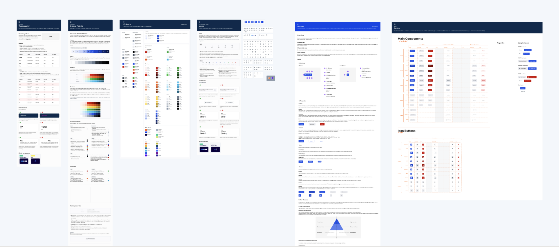
Foundations & core components — typography, colour, icons and buttons, each documented on the new system.
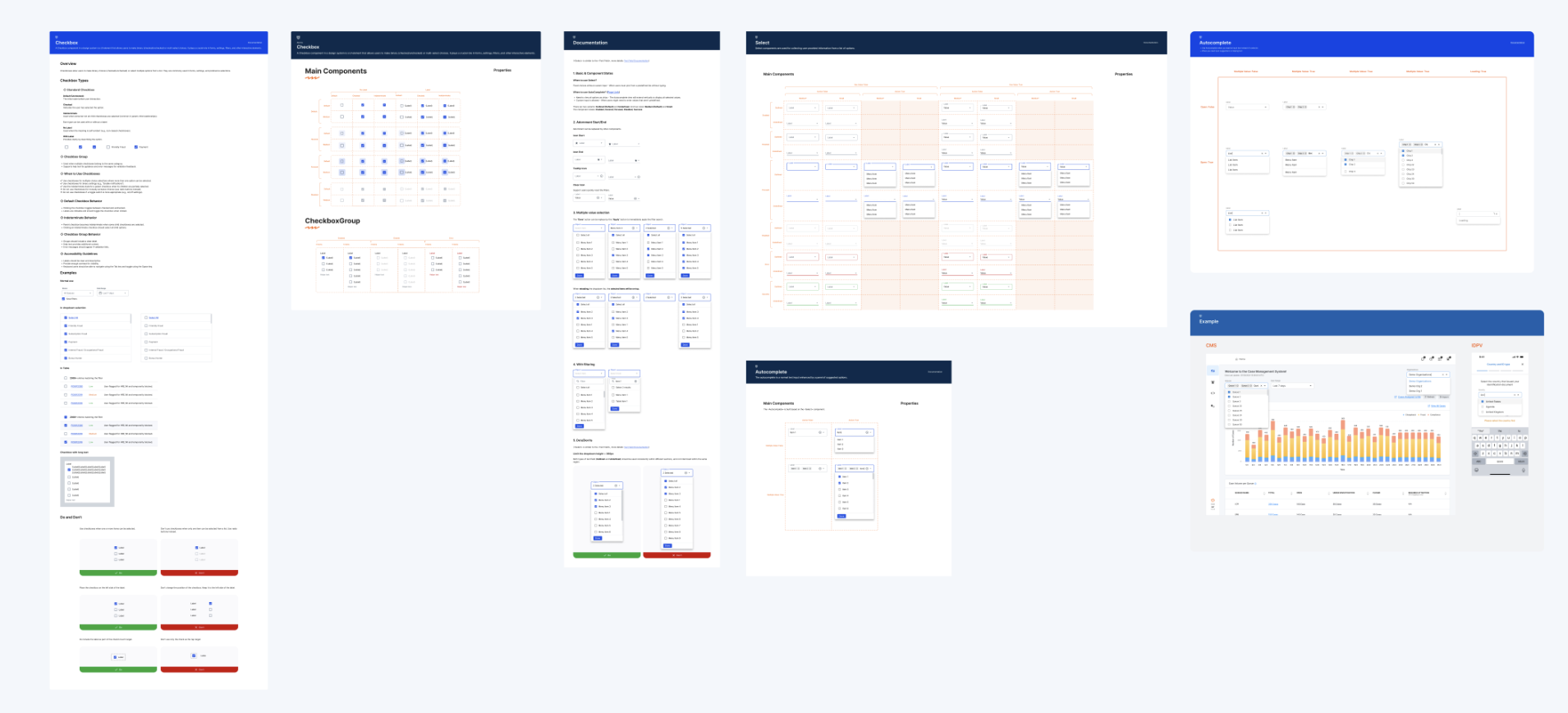
Interactive components — checkbox, select and autocomplete with full states, applied in a real product screen.
- Faster, at lower costBoth designers and developers move quicker — process optimisation, the core payoff of a design system.
- Shared languageConsistency across products that directly improves the user experience.
- Consistent libraryComponents are consistent across products and aligned with best practices.
- Reliable componentsDesigners have clear, dependable components to work with.
- Living documentationDocs stay up to date and simpler to use with the system.
- More time to createLess time fixing the system, more on new product solutions.
- Modern stackBootstrap and outdated custom elements removed; migrated to customised MUI.
- Stable migrationThe MUI migration landed on a stable foundation — no new errors or chaos — across a live base of ~500 internal and ~5,000 external users.
How I work
How I run design
Process isn't paperwork — it's how I de-risk decisions and keep design, engineering and QA moving as one. Every project runs the same spine, sized to the stakes: frame the real problem, prove it cheaply, ship it, then measure and loop.
Grounded in the Double Diamond and the desirability–feasibility–viability lenses — adapted to how the team actually ships.
Principles
01
Problem before pixels
I don't open Figma until we've agreed what we're solving and why it matters — for users and the business.
02
Decide with evidence
Test early and cheaply. A signal from a real user beats the loudest opinion in the room.
03
No solo launches
Design, engineering and QA share one documented understanding before anything ships.
04
Close the loop
Launch is not the finish line. We measure against the goals we set and feed what we learn back in.
The model
The Double Diamond maps the whole journey — diverge to explore, then converge to decide: first on the problem, then on the solution. The six numbered stages live inside it — each one is expanded in detail below.
The stages, in iterations
The work runs in three iterations, not a straight line — each repeats until its gate is met, and the whole thing loops again after launch.
Every stage is a gate — I don't move on until its output exists and the team agrees it's done.
Iteration 1Discover & DefineProblem space
1Frame the problemUnderstand the task
Pin down what we're solving and why it matters — for users and the business — before anyone opens Figma.
Key moves
- Interview the requester and stakeholders; separate the real problem from the proposed solution.
- Run user research where the answers are not known — talk to real users, not just stakeholders.
- Validate it's worth doing with evidence — user feedback, analytics, business priority.
- Write success criteria you can actually measure.
- Surface the risks and how you'll de-risk them.
- Assemble the squad — design, engineering, QA, product — and align on scope and timeline.
- Run the kickoff questions (below) and document a shared understanding the team signs off.
Output
One-page brief
Done when
- The problem, its impact and success metrics are written and agreed.
- The whole team shares one understanding of scope, risk and timeline.
2Choose a directionConceptual design
Explore a few high-level directions and commit to one — on logic and trade-offs, not pixels.
Branch: big or risky task → run this stage; small, low-risk change → skip straight to lo-fi (stage 3).
Key moves
- Diverge — sketch several genuinely different approaches with the team.
- Pressure-test each against the problem and its impact on users; note the trade-offs.
- Score on impact versus effort and commit to one.
Weighed against three lenses
DesirabilityDo people actually want it?
FeasibilityCan we build it with what we have?
ViabilityDoes it make business sense?
Start with desirability — the human lens. The strongest direction is the one where all three hold.
Output
Concept doc — direction + rationale
Done when
- One direction is chosen and the reasoning is written down.
- It's expressed as an idea, not a drawing.
↻Repeat until the problem and direction are clear and backed by evidence.
Iteration 2DevelopSolution space · core loop
3Prove it in low fidelityLo-fi mockups
Take the direction to a minimum viable design and lock the feature list.
Key moves
- Map the key scenarios and their edge cases.
- Build the smallest design that lets you test those scenarios.
- Agree the full feature list and the first slice with the team.
- Optional — a clickable prototype and a design-team critique.
Output
Feature list + minimum viable solution
Done when
- Every key scenario and edge case is covered.
- The feature list and first iteration are agreed.
3.1Test with users — before you build
Validate the design with real users while it's still cheap to change.
Mandatory for new or high-risk work — skip only for small, low-risk changes.
Key moves
- Plan the test — pick users and scenarios.
- Run it, and capture observations and suggestions.
- Analyse, find the weak spots, iterate and retest.
Done when
- The design reflects what real users showed you.
3.2Sanity-check with engineering
Confirm it's technically sound and understood before going hi-fi.
Key moves
- Walk developers through the lo-fi and discuss the technical details.
- Get feasibility feedback; adjust and re-discuss if needed.
- Document the agreed approach for the team.
Done when
- Engineering understands and signs off the approach.
4Design it for realHi-fi mockups
Produce a build-ready layout for every main flow.
Key moves
- Design each main scenario; handle all states and validations.
- Annotate the intent so nothing is left to guesswork.
- Build from the design system — reuse components, and extend the system when something is missing.
- Check accessibility — colour contrast, focus order, keyboard paths, labels.
Output
Build-ready layout + implementation notes
Done when
- All main flows, states and validations are designed and annotated.
↻Iterate: sketch → test → refine. Repeat until it works for users and is technically sound.
Iteration 3DeliverSolution space → launch
5Hand it offDesign hand-off
Transfer the design so engineering can build it without guessing.
Key moves
- Walk developers through the hi-fi — including empty and initial states and every validation.
- Capture feasibility feedback, adjust, and re-meet if needed.
- Document the final agreed solution for the whole team.
- Support the build — stay available through development to answer questions and review work in progress.
Output
Complete hi-fi spec
Done when
- Engineering has everything needed to build.
- The final solution is documented and agreed.
6Verify on QATDesign QA
Make sure what got built matches what was designed — to a high bar.
Key moves
- Check the build against the documented design, element by element.
- Test interaction, responsiveness, motion and typography.
- Run an accessibility pass — keyboard, focus, screen-reader labels, contrast.
- Log issues with QA, get client sign-off, developers fix, then re-test.
Output
QA'd build that matches the design
Done when
- The build matches the design, issues are fixed, and it's client-approved.
7Measure & learnAfter launch
Find out whether the live solution actually moved the metrics we set at the start.
Key moves
- Track the success metrics from Iteration 1 against real usage.
- Gather qualitative signal — support tickets, feedback, session reviews.
- Decide: ship as-is, improve, or roll back.
- Write up what we learned and feed it back into Discover.
Output
Impact readout + next-iteration backlog
Done when
- We know if the goal was met, and the next iteration is scoped.
↩After launch, measure against the metrics from Iteration 1 and feed what you learn back into Discover — the loop begins again.
The kickoff
The checklist I actually run at kickoff — abbreviated here. For a new feature or product I work through all of it before diverging into discovery; for an enhancement, a lighter subset, reusing prior research.
People9
- Who is responsible for the product?
- Who has the final say?
- Who sets the strategic direction?
- Who decides on features?
- Who designs the product?
- Who develops it?
- Who should be kept informed of progress?
- Who knows the product's history and why decisions were made?
- Who is responsible for support?
Goals5
- What are the goals of the project/feature — what do we want to achieve?
- What benefit should it bring the business?
- What if we don't achieve the goals?
- How will we know the goals are met?
- What will we measure to know?
Users4
- Who are our users, and why?
- What do we NOT know about them?
- Which assumptions about users should we verify?
- Why do they use the product — motivations, needs and goals?
Strategy3
- What value does the product bring users?
- Why will people use it?
- Why our product instead of competitors?
Scenarios1
- What tasks should the product help solve — which scenarios must it support?
Metrics3
- How does the product earn or save money?
- How does user behaviour translate into profit?
- What metrics will we monitor to understand performance?
Dates3
- Are there important dates or deadlines?
- When is the deadline, and why?
- What happens if we miss it?
Risks6
- What can go wrong?
- Who or what can it affect?
- How bad could the consequences be?
- How likely is it?
- Do we need to act?
- Who owns preventing or solving it?
UX artifacts
System thinking
The thinking behind Atlas — how the product is structured, how a case moves through it, and where the experience can improve.
These artifacts shaped the 2025 scope — one workspace, a shorter case flow, and a shared language across teams. Anonymised and generalised; the originals are under NDA.
Brainstorming
💡
Brainstorming
Goal: cut time on manual, repetitive work by 30% — and shorten onboarding for new hires.
What could make the fraud-analytics process more automatic?
Run the NN/g way: frame one sharp “How might we”, then diverge for volume — judgment deferred, wild ideas welcome, building on each other's notes. Then converge — cluster into themes, dot-vote, and pull the winners into scope. It's how I keep ideation focused but open.
For new users
“To add an operator you must remove all of them first — not intuitive for a new user.”— Maria, onboarding
Inline hints that explain what a field does and when to use it.— Hannah
A short guided tutorial for first-time actions — block, filter, export.
Explain the difference between auto-block and manual block in context.❤️
“What's the newcomer version?” — a simpler default view.
For expert users
Bulk actions — filter and act on many records at once.— Expert user
Filter by specific block reasons (IP, boundary, MAC) and combine them.
Hit multiple types in one query — device · user · operator.
Exclude test / QA accounts from working views.
Log every merge / undo so history stays reversible.👍
For clients
A block-management dashboard, like CMS — one place for everything.— Client feedback
Widgets: device-sharing blocks by state over a time period.
Compliance & fraud widgets on the overview.
Show only blocks currently in effect per operator / user.👍❤️
Export from device & user search pages.
One of several ideation boards — ideas clustered by audience, voted (❤️ / 👍), then prioritised. Result: the top-voted ideas became the block-management dashboard and bulk actions.
Information architecture
Atlas had grown into several tools with separate logins. I mapped it into three clear areas so everything a case needs sits one or two steps from the queue. Result: a scattered, multi-login workflow collapsed into one workspace.
Atlas platform
Home & dashboards
- Overview
- Performance
- Compliance
- Anti-fraud
- Edge monitoring
Investigation
- Live map
- User / device profile
- Users & devices
- Multi-level search
- Transaction details
Operations & output
- Restrictions / block list
- Saved views
- Reports
- Report builder
- Preferences
User flow
The core task — an analyst works an alert from the queue to a documented, auditable decision.
Alert / triggerQueue · search · report
→
TriagePriority & ownership
→
Open caseLoad profile & context
→
Gather evidenceTransactions · devices · history
→
Cross-referenceSimilar cases · watchlists
→
◇ Assess riskDecision point
→
Blockdevice / user
Clearno action
Escalatespecialist + peer review
Document & closeReport + audit trail
↩
Feed backTune triage rules
◇ = decision point. Every branch is reversible and logged, and outcomes feed back into triage. Result: fewer steps to a decision, and no dead ends.
User journey
The same task from the analyst's side — what they do, how it feels, and where it breaks down. The pains here — no triage, scattered data, risky final actions — set the redesign priorities.
Stage
Trigger
Investigate
Decide
Act
Review
Touchpoints
Alert queue · email
Case profile · map · history
Risk panel · similar cases
Action modal · block list
Report builder · audit log
Doing
Scans the queue, picks an alert
Opens the case, reads evidence across sources
Weighs risk signals against policy
Blocks, clears or escalates
Logs the outcome and files a report
Feeling
Rushed — unclear what's urgent
Overloaded — data is everywhere
Anxious — a wrong call is costly
Wants certainty it's reversible
Relieved once it's documented
Pain point
No triage — everything looks equal
Switching tabs & logins to piece it together
No summary or precedent to lean on
Actions feel final and risky
Manual, repetitive report writing
Opportunity
Prioritised, auto-triaged queue
One case view with linked data
Risk summary & similar cases
Guided, reversible, audited actions
One-click report + trail
Service blueprint
Front-stage and back-stage — what the user sees, what the team does, and the systems behind each step. Result: design, engineering and ops aligned on one flow, front to back.
Layer
Trigger
Investigate
Decide
Act
Review
User action
Picks an alert
Reviews evidence
Judges risk
Applies a decision
Files a report
Frontstage · UI
Queue, filters & priority tags
Case profile · map · transaction history
Risk panel · similar-case suggestions
Action modal with confirm & undo
Report builder · export
Backstage · team
Triage rules & routing
Data enrichment & joins
Peer review on escalation
Block propagates to operators
QA & client sign-off
Systems
Alerting engine
Data lake / analytics
Risk-scoring service
Block-list API
Audit log / export service
Support · SLA
Auto-prioritised in < 1 min
Evidence loads in one view
Guidance from policy & history
Reversible within retention window
Audit-ready, exportable trail
Next project
Launchpad